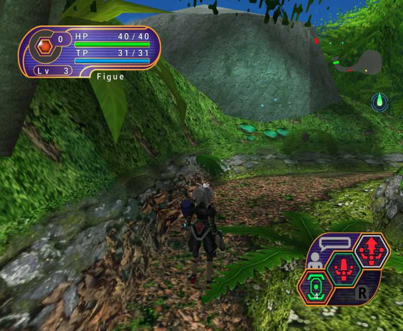
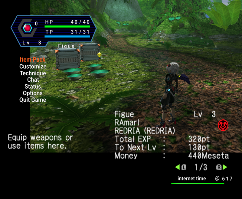
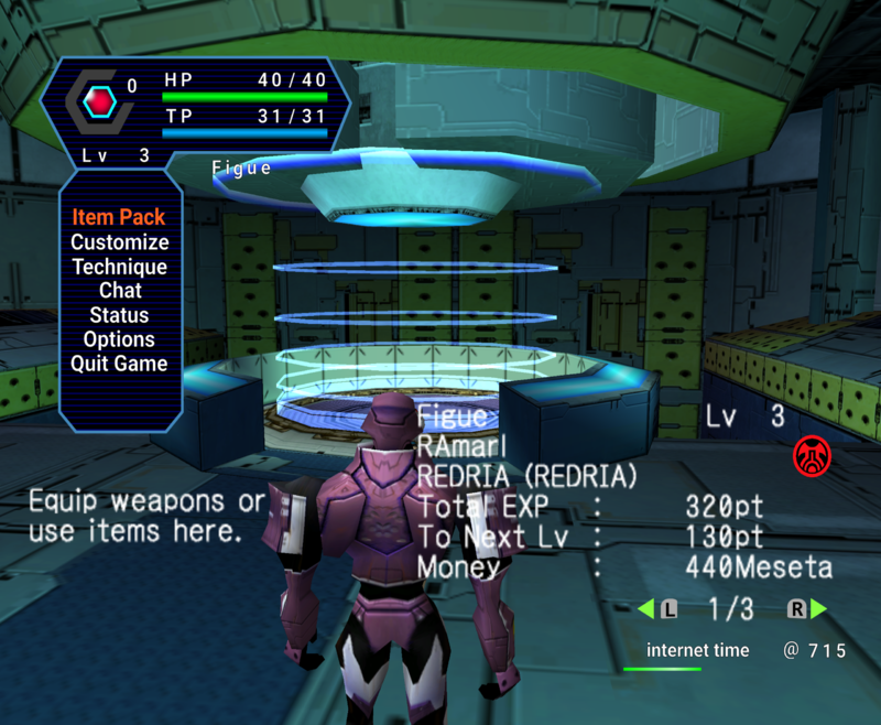
PSOGC HiRes HUD (for use with Dolphin emulator)

MagicLuthee

Member
Project Goal :

- Recreate the look of the original UI but in High Resolution

Project Details :

- It is not an upscale.
- Made in Illustrator / Inkscape which means "master-files" are resolution-independent.

Shortcomings (as of right now) :

- Replacing all occurences of in-game font(s) is impossible.

Changelog :

Inventory Icons:
- Star-like icon on yellow background has been redrawn

Item 'Rarity' Stars:
- Tweaked to more closely resemble the symbol-chat star icon shape

Palette / Spell Palette:
- Fixed several vector path errors some of which were visible

Red/Green/Yellow/Blue Gems (HUD):
- Tweaked / Accentuated glare

- Too many changes to list them all !

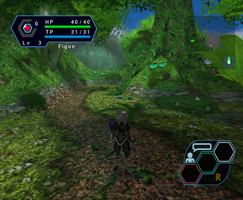
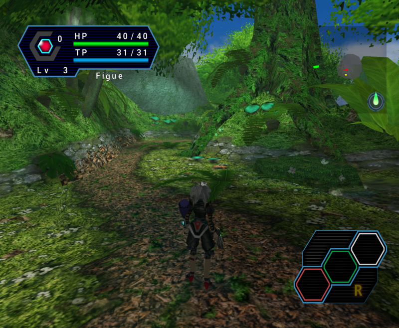
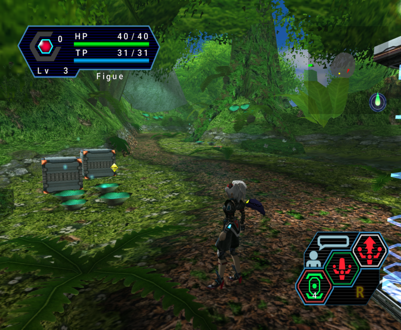
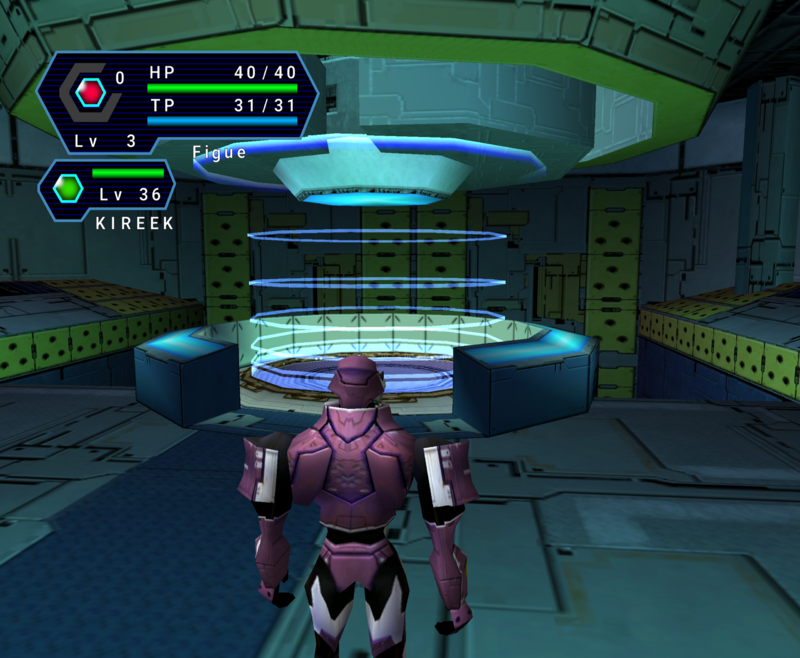
Images :

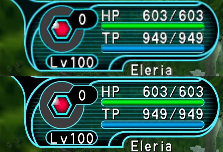
June 2020 Comparison.png

Download :

v0.5.1 High Res UI

v0.5.0 HUD Font (Made from scratch / relatively "faithful" / amateurish feel)

Note : Release(s) tagged "Compat" use an older compression scheme which discards more detail but is supposedly more compatible.

About Me :

Born in the late eighties, not a professional artist, would label myself as a "vector graphics enthusiast".

Contact & Progress Updates :

Eleriaqueen's Twitter

Show your Support :

Eleriaqueen's Tip Jar

Buy Eleriaqueen a Ko-Fi

[Win 10]
Put the zip file downloaded in "Releases" section of the github page into "ResourcePacks" directory located under "Documents/Dolphin Emulator/"

Use "Load Custom Textures" as well as "Prefetch custom textures" settings in Options->Graphics->Advanced

(You can switch "Load Custom Textures" off and on during gameplay)
 
Last edited:
There's a new version coming soon-ish, with dozens of fixes and a much higher %-age of the UI done (you might be surprised how many more UI elements have been done), of course most of the UI isn't final.

I'll probably also add an optional link to the port of (Google's) Roboto font for PSO I did a while back.
 
Updated download link with 0.1.0-beta, tons more assets are included !
Roboto font for PSO is included too.
Please try the resource pack, comments/ideas are appreciated :)

Also added Original vs HiRes comparison pictures to original post.
 
Last edited:
Started working on version 0.1.1

Inventory Tab - 0.1.0.png <- before (rounded square)

Inventory Tab - 0.1.1.png <- after (ellipse shaped)

Asset Txt@2x.png <- Added to main window (used in multiplayer UI)

PB Count Original.png <- Before
PB Count Remade.png <- After

Squares - 0.1.0.png <- Before
Squares - 0.1.1.png <- After

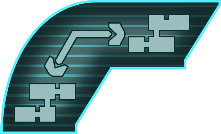
Radial Map Button - 0.1.0.png

Radial Map Button - 0.1.1.png

File Icons - 0.1.0.png

File Icons - 0.1.1.png
 
Last edited:
Sorry for neglecting this thread, version 0.2.0-Beta has been available for download for some time (see Original Post for link).
I'm actively working on this project still... :)

(Updated original post with a more up-to-date "HD" image)
 
Last edited:
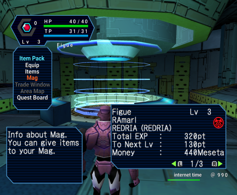
Version 0.3.0-Beta3 is available for download.


By the way, I'm experimenting and going down the colourful rabbit hole that is theme creation...

GPOP8P-26.png
GPOP8P-28.png
 
Last edited:
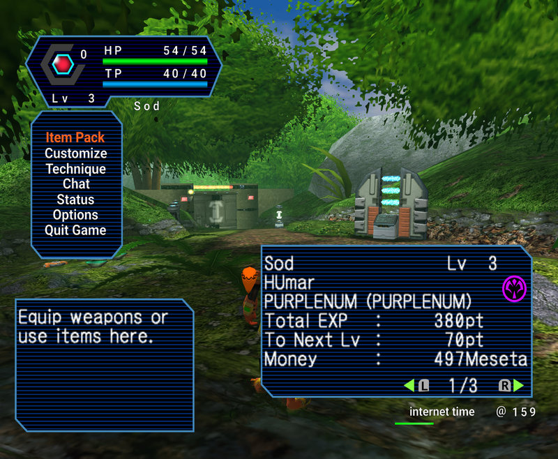
Two more colour themes I made, yay for diversity !
GPOP8P-38.png GPOP8P-30.png
(Don't mind the shining effect on the upper left UI, it's entirely PSO's fault XD)

-----------------------

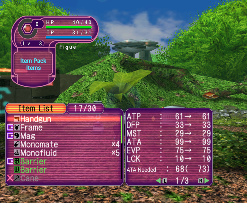
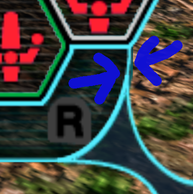
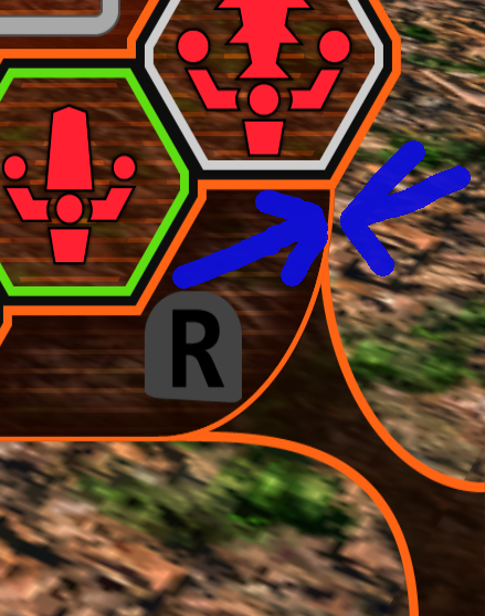
Original (official) UI is full of little issues like this one where two elements were badly drawn and so one kinda "bleeds" through :

GPOP8P-36.png


I solved this issue in my UI :

GPOP8P-37.png
 
Last edited:
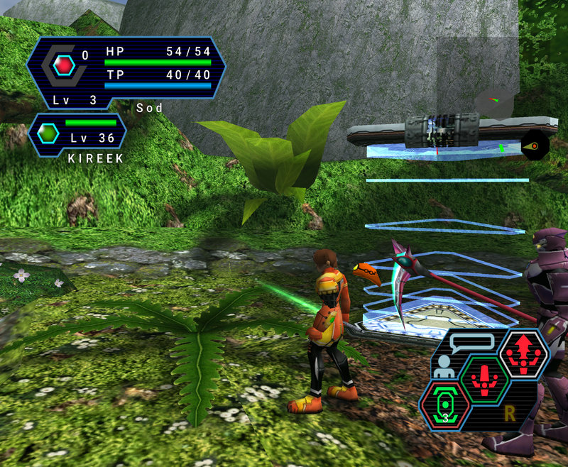
Good suggestion, that being said I don't know the extent of the work that's needed for that. But design-wise from what I can tell Dreamcast UI is very basic. @Aleron Ives , O Dreamcast God, can you procure me with the extracted dreamcast UI texture files ? :p (they are paletted too right ? I have no idea how to work around that)
 
Last edited:

Well, the DC textures are stored in PVR format, so the only way to manipulate them completely is with the PhotoShop PVR plugin that comes with the Dreamcast SDK. VMT is able to extract BMP images if that's all you need, though. Which files contain relevant HUD information besides f256_hyouji.prs?
 
I have a question : Are there any UI differences between PSO and V.2 ?

Hmm it seems there's also an app called PuyoTools handles various formats like XVR / GVR ... etc
Edit : Yes it works well, I can extract PNG files from a [PVR + PVP] pair for paletted textures and simply PVR for non-paletted ones.

Extracting PRS files from the GDI image was a pain, had to have it in CDI format else GDROM Explorer errored out (had a GDI + 3x BIN before that and could only extract files from first track which was a dummy)

At first glance doing a PSO DC UI will require drawing the whole thing (which isn't an issue as it'll only take time and effort), most elements I did for my "standard" HD UI won't be of any use.
Stuff like "Action Palette" is quite different, GC uses a "radial" type UI while DC used a "diamond" shaped one. I need to make sure DC type can actually fit onto the GC texture sheet, if not I'll have to get creative ^^

Misc :
I replaced images in-game screenies in original post.
 
Last edited:

Here's an attempt, many elements will have to be adapted and cannot retain their "DC" shape.

GPOP8P-1.png
@Aleron Ives would people still use a not-exactly lookalike PSODC UI ?
Or should I not bother with that approach and simply do a colour theme for PSOGC UI ?
 
Last edited:
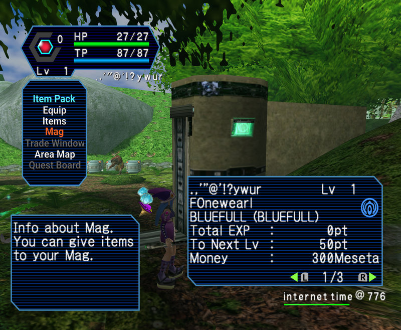
The only difference I can think of is that V1 is missing the icon for the quick menu. When you hold R, you still see the chat icon on the Y button.

There's no point in trying to keep the DC Action Palette shape, because then the button press effects will be broken and require a bunch of code changes to fix. IMHO it makes more sense to keep the GC Action Palette layout, but use the style of the DC one, assuming you can figure out a way to keep it looking kind of diamond shaped while keeping the GC button layout.
 
With PSOGC style radial elements.
GPOP8P-2.png

I can give them a blocky shape though. ^_^
GPOP8P-4.png

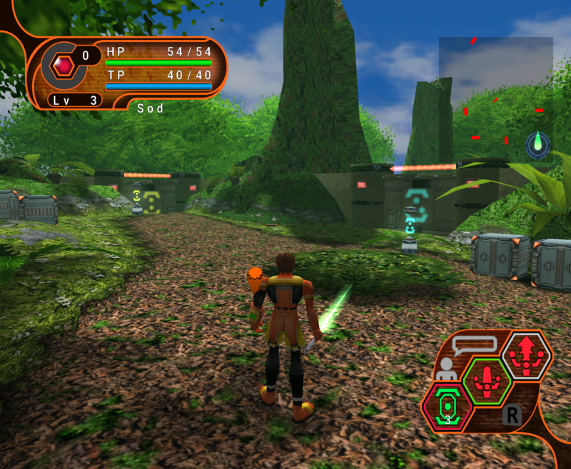
Further Progress (inc. palette icons)
GPOP8P-6.png

Companion / Team Mate UI Element
GPOP8P-7.png

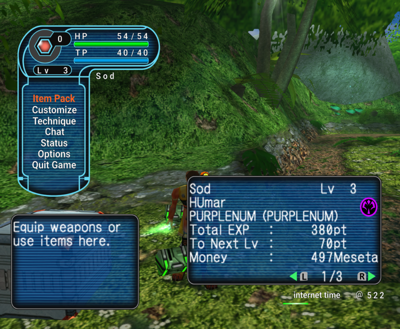
Start Menu (adaptation)
GPOP8P-8.png

It's coming along nicely !

GPOP8P-41.png
 
Last edited:
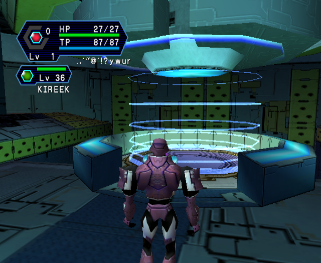
Fixed PB Gauge shape being weird, it's position was slightly altered as well.
Modified "Player Gem" position.
Modified "Player Gem" shape to reflect PB Gauge shape.

Edit : Fixed some more things :
Modified left most part of the HUD so that it ends in a point rather than a "bevel".

GPOP8P-46.JPG

Fixed "Companion / Team Mate HUD" shape to be in line with main HUD and "player gems", it was really wrong before...

GPOP8P-49.jpg

Edit 2 : "Plugged" a hole in the HUD...

GPOP8P-48.png GPOP8P-52.png
 
Last edited:
Improvements have been made thanks to Aleron Ives who provides useful suggestions.
Left side of HUD is more accurate.
- Cyan border is closer to "Lv" text.
- Reduced "empty space" between PB gauge and leftmost end of the HUD. (It's pretty much impossible to have it perfectly looking like on DC because "Lv" text seems to be displayed slightly more to the left on GC than on DC)
GPOP8P-40.jpg
 
Last edited:
Hey so I worked a bit on "Companion / Team Mate" HUD element :
- Reduced space between upper cyan border and HP Bar.
- Reduced bottom "slope" size (On GC, team mate name is drawn quite a bit lower than on DC though...)
- Reduced space between "Lv" Text and lower cyan border.
- Reduced space between bottom cyan border and team mate "Gem" as well as between upper-left cyan border and "Gem".
GPOP8P-47.png
 
Back
Top