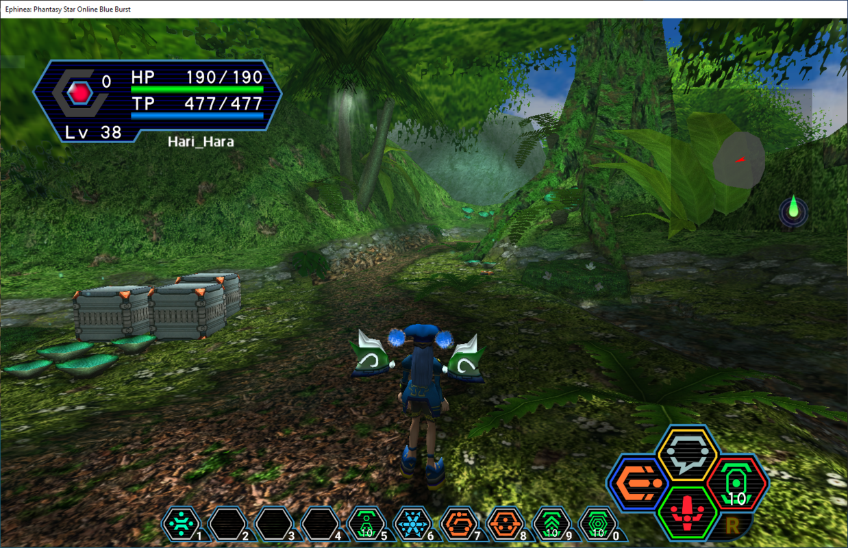
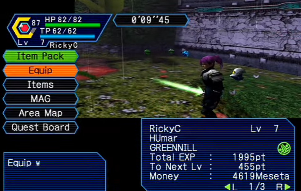
Dreamburst HD UI Project by Luthee (a.k.a Eleria)

MagicLuthee

Member
Goal(s) : Provide a High Resolution UI for the Ephinea PSOBB client that resembles the DC/Ver.2 one.

Status : Work-in-Progress (Usable)

Important: Please don't edit/repack/bundle/rerelease or host alternative download(s) of any file from this project, thank you.

Download(s): Releases are available on my Google Drive

Note(s): Only English is supported !

CapturePSOBB01.PNG

Consider donating to support me and my work.
 
Last edited:
As someone who started on DC Ver1 from launch, and never really played after Ver2 until starting on Ephinea, I'm kind of unreasonably excited to have this set up. Thank you, thank you, thank you!

Also, I'm curious about the "Only English is supported" note. I haven't seen any particular issues with JP language setting so far. Are there supposed to be some artifacts with language settings other than English?
 
I'm curious about the "Only English is supported" note. I haven't seen any particular issues with JP language setting so far. Are there supposed to be some artifacts with language settings other than English?
Isn't some text like a few ingame menu entries and such normally in kana when set to JP ? It's been a while since I've looked at the files but those would then appear in english I guess.

I think I wrote the words "Only English is supported" at the time mostly to waive responsibility if things broke for other languages haha

Thank you for checking the project out @pierrot
 
Isn't some text like a few ingame menu entries and such normally in kana when set to JP ?
Yes, practically all of the menu entries are, but I haven't seen anything in the UI that reverts to EN instead yet. Shop/Bank and Quest info, etc, also appear to be fully in Japanese (as long as they aren't EN only quests, but that's typical with the default UI, too).

I thought that note might be there as more of a waiver, so at the very least, this is just some feedback that it appears to work with JP language setting also.

Anyway, thanks again for sharing this! Maybe a little silly, but I kind of can't get over how much more at home this UI makes me feel while playing on Ephinea.
 
Thanks for creating this mod. I'm trying to transition from the dreamcast version to bb and this makes me feel right at home. Also, just curious but is there a reason why the diagonal menu edges from the dreamcast version aren't there when you press start for the menus or is it just your style choice? Either way thanks for the mod and I really hope you continue to work on it because I kinda want it to be my default for how my game's ui experience is.
 
Thanks for creating this mod. I'm trying to transition from the dreamcast version to bb and this makes me feel right at home. Also, just curious but is there a reason why the diagonal menu edges from the dreamcast version aren't there when you press start for the menus or is it just your style choice? Either way thanks for the mod and I really hope you continue to work on it because I kinda want it to be my default for how my game's ui experience is.
Hi, thank you for checking this mod out !
I'm unsure what you're talking about when you say "... why the dragonal menu edges from the dreamcast version aren't there when you press start for the menus...".
If you're talking about the junction between the two teal lines (lines that the game draws as outlines to the menu background) then all I recall is I never found a way to make it look good. It is an exremely small image that the game displays with what looks like incorrect pixel-aligment and if I remember correctly the issue was even nastier when trying to replicate the dreamcast UI.
To be honest It's been a while since I fired up Ephinea. Last time I played BB was with a custom Tethealla client directed to my self-hosted test server and that Teth client had been patched to remove the teal lines so they would not ruin the colorful version of my HD skin I had applied.

Hmm on the other hand if you're talking about the menu categories (Item Pack / Equip...) and their left and right edges, I think there was an issue where I could not fit pointy enough edges in what space I had to work with and it looked terrible.
Screenshot_20231103_212320.png

Edit:
I'm going to re-install Ephinea PSOBB to have another look at the issue later (Currently playing Star Ocean The Second Story R which is insanely good). I'm on Linux now (Endeavour OS to be precise), but Bottles should abstract most of the Wine stuff for me (I hope).
 
Last edited:
Back
Top